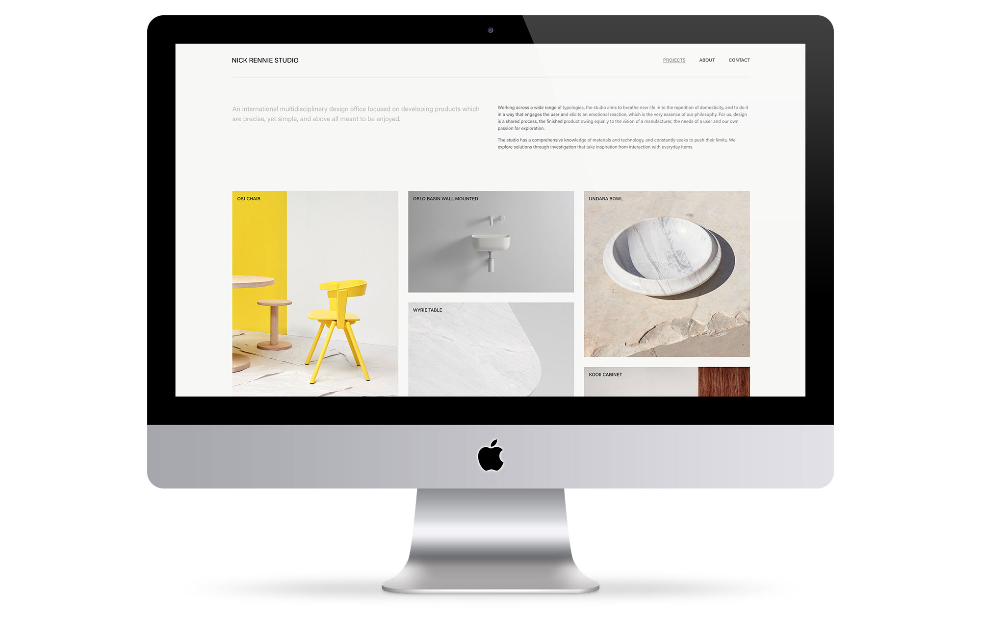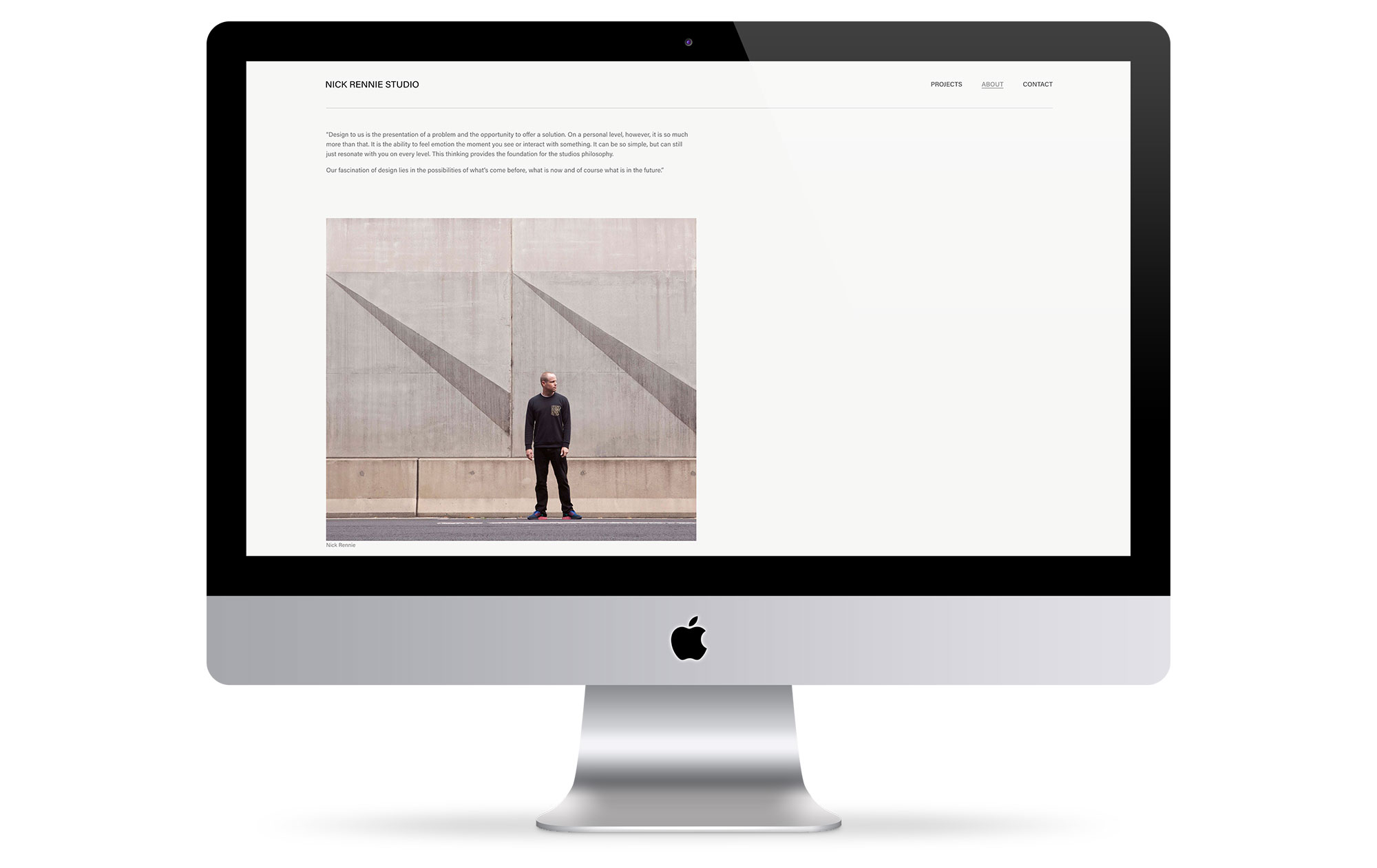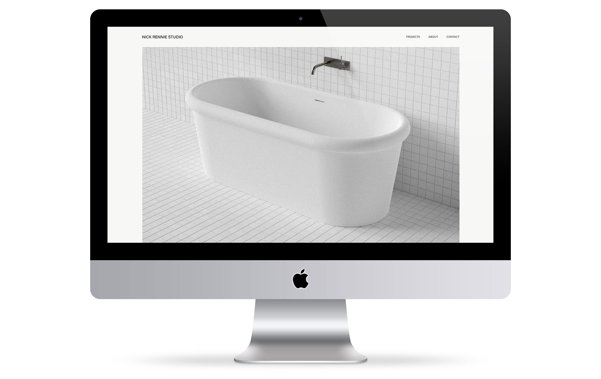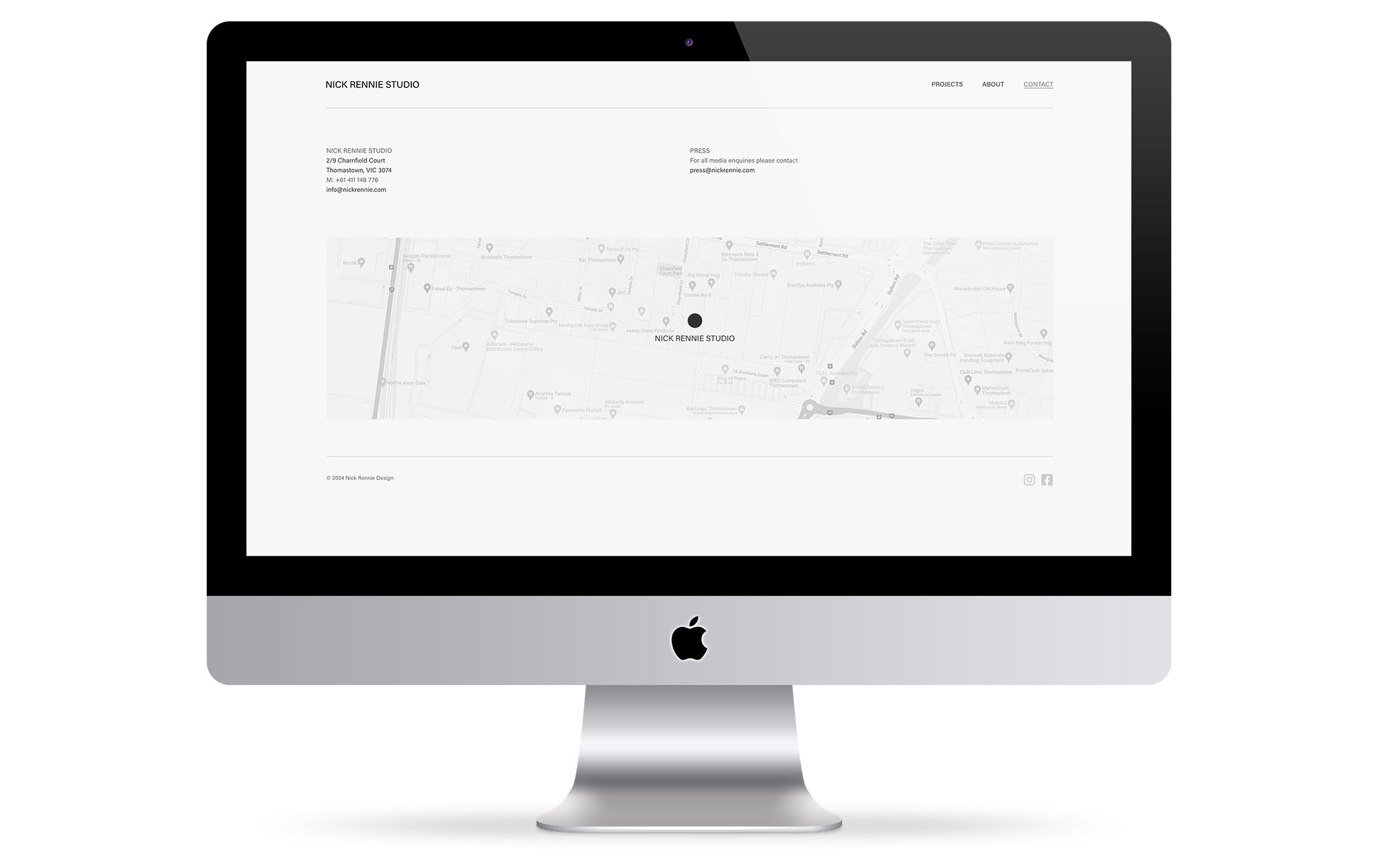


The Nick Rennie Studio website has stood the test of time very well. The studio’s very broad range of stunning projects become the hero within the slick & minimal website shell. Originally built in early ’07, the website structure was in need of an upgrade to keep in line with modern practices and requirements. A good chance to add some content and also make some small and subtle improvements. The responsive WordPress website rebuilt with the Elementor page builder now makes it very simple to make updates, has an elastic header and also has a project grid that fills randomly with each page load, this helps to keep the site feeling fresh and encourages users to explore. Website design, build and implementation by pixelshifter.
show me –