Well it can be when you present it well. So much data, so little time to interpret. The good people at informationisbeautiful.net are doing their best at presenting data in more visually pleasing ways that when done really well, makes you see and think about the data differently. Traditionally presented in stale spreadsheets and vast stacks of numbers, data that is understood and then treated with some thought, design and colour and even movement can have a profound effect. Well I think it’s pretty rad. Plenty more to see on their website, some of my favourites below.
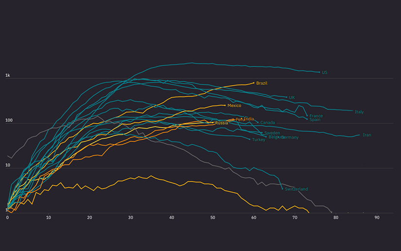
Various COVID-19 data infographics.
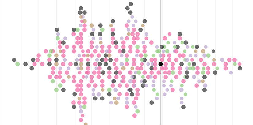
How old are you? There may still be time for your genius.
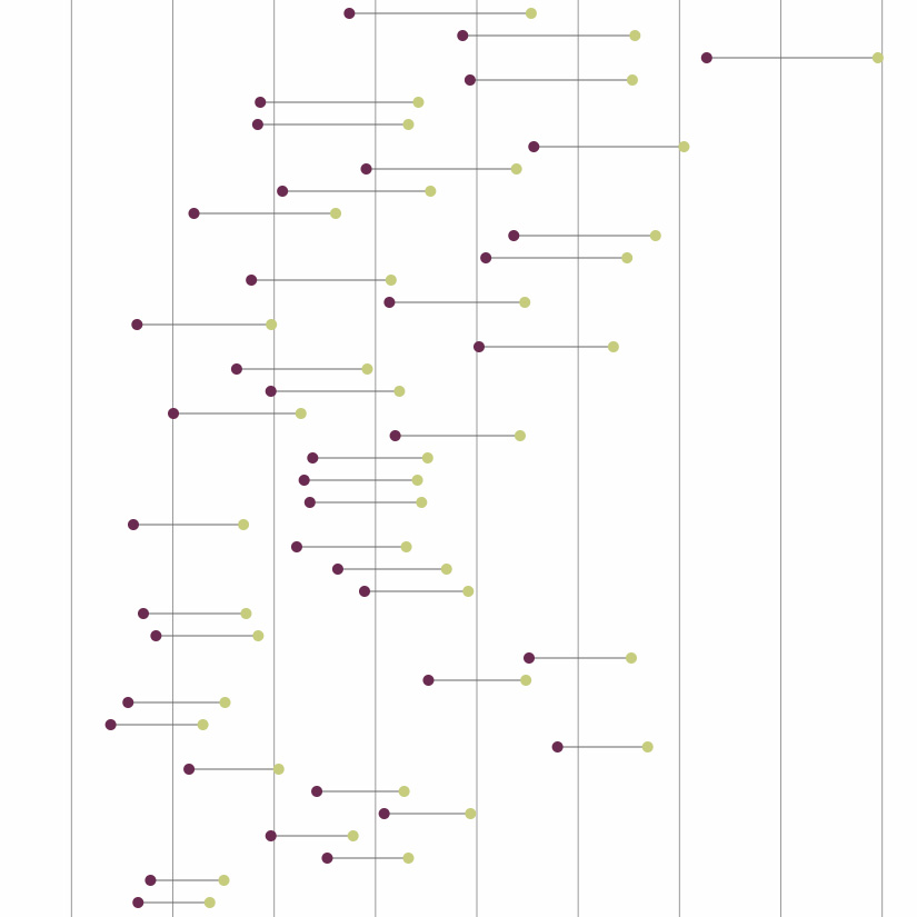
The gender pay gap. Somewhat alarming.